DESIGN BY ESTUDIO VERSUS
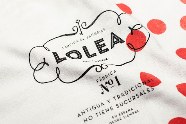
Welcome back sweet friends! This past week while searching the web for new and innovating design, I stumbled upon this polka dot beauty. Not only is the package design to die for, but the whole branding of the company is incredible. Meet Lolea...
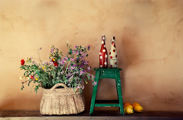
They are a Spanish (from Spain) company that manufactures artisan Sangria. Okay... I will admit that they got me there. Oh, Europe and the amazing food, culture, and... adult beverages! Nevertheless, the design is stunning on every single bottle and package. The light and minimal features are in absolute balance and incorporates traditional with a twist. The typography chosen works perfectly with the simple polka dot background and with the product's message.
On Lolea's website, you are able to find the product inserted in several scenarios (awesomesause marketing here...). All scenes seem like they were taken from a classic European movie, where simplicity and elegance collide in such an astonishing way. It transports you to an intimate place, a place where you imagine yourself spending the afternoon with friends and family.
Oh how I wish I could transport myself to Spain, sit down near the water and sip on this super well designed (and probably delish) Sangria. Don't you?
xoxo,
m
Don't forget to leave me a comment! I love when you do. And if you have anything else to add, please do! Want to collaborate? Shoot me an email: marianahodges1(at)gmail(dot)com.


Que lindas!! Só você para achar umas coisas tao diferentes assim. bjs
ReplyDelete